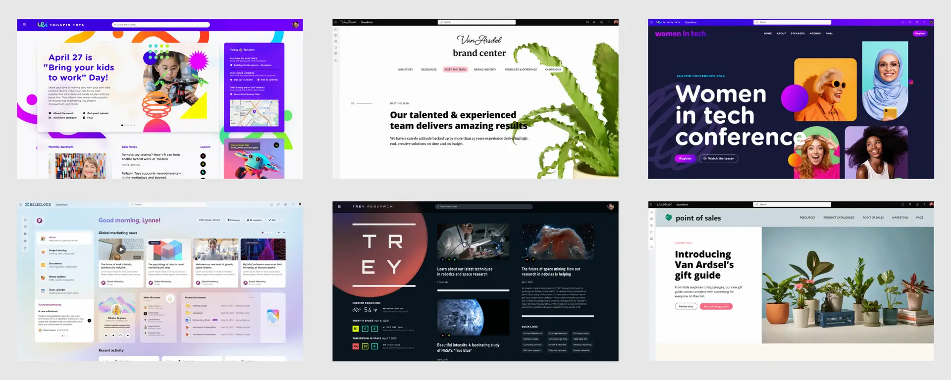
SharePoint has undergone a huge transformation over the past year. Whereas its capabilities used to be fairly limited, it now offers endless possibilities when it comes to look and feel (branding). We owe this mainly to SharePoint’s new branding center. Last year, Microsoft already started rolling this out, where, for example, it was possible to add your own font (typeface) or edit images (add overlay and give images different shapes). And this month Microsoft added perhaps the most promising feature: Flexible sections.
As a Marketing & Communications professional, I know better than anyone how difficult it was to get a SharePoint intranet fully aligned with your company branding. The options were limited, leaving you little room to really make the intranet your own. Fortunately, that is now a thing of the past: with the introduction of flexible sections, the possibilities are endless!
A flexible section is a new type of section in SharePoint that allows users to build pages without the limitations of “traditional” column structures. This means that webparts can be flexibly moved and resized, allowing you to create a fully customized section. Compare it to the freedom you have in PowerPoint: you can drag, scale, overlap and group elements to build a unique and visually appealing page.
This new functionality gives you the freedom to completely align your intranet with your organization’s branding, with a design that is both beautiful and functional.
With the advent of flexible sections, you can design your SharePoint pages completely as you wish, without being stuck with predetermined layouts and structures. For example:
Let images and text blocks overlap. For example, you can put a background behind text or put figures behind images.
Merge different elements into groups and place them exactly where you want them.
Put elements where you want, while the grid lines in the section help to align everything neatly.
Take advantage of new templates based on flexible sections. Get inspired and start with a basic design that you can easily adapt to your own style.
You are no longer bound to predetermined layouts and structures. As a result, almost anything is possible. At the same time, this can also be a pitfall. The risk of too much freedom is that your intranet becomes cluttered. A thoughtful approach is therefore important.
Designs may not work as well on mobile devices. Would you like your intranet to work well on mobile? Then it is important to test if your design looks good everywhere and take this into account when designing.
Not all webparts are completely flexible. Some webparts still have fixed width options, which may limit your design slightly. But with a little creativity, this won’t get in your way.
Are you already using Microsoft 365 apps? Then it’s fairly easy to get started with flexible sections in SharePoint on your own:
For me as a communications and marketing professional, this means a world of difference. The creative freedom I now have to fully align design and content with the company branding offers unprecedented opportunities. What started as a challenge is now an opportunity to transform our intranet into a beautiful and impressive platform, fully tailored to our needs.
Would you like to get started with this and spar about the possibilities? Or are you curious how we applied this for our own intranet?
We would love to share our insights with you! Contact us and we’ll talk soon.
